ACO Sun

Packaging design
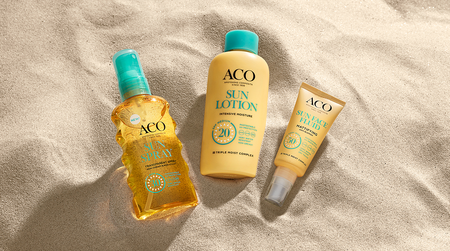
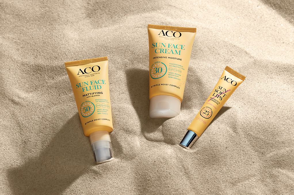
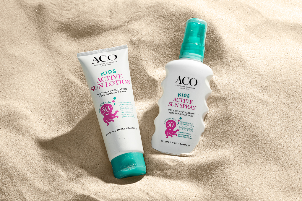
The ACO Sun case was started in 2016 with the re-design of the products. Our strategy was to build a strong brand block but providing easy navigation to find the right product and spf within the large range, consisting of 24 products. We gave the products a uniform design with a yellow packaging, a kick turquoise on lids and artwork and a graphic element guiding you to the desired spf. This yellow shelf has proven a success providing great sales numbers since the launch.


Image style
In both still and moving images we portray every day moments when spending time in the sun safely. ACO moments take place in a natural setting, and are portrayed with warmth and calmness. They capture moments from everyday life that can be associated with ACO products. Our ACO micro moments help bringing emotion and recognition to our brand both in still and moving images.


