Packaging design & communication concept
RE-DESIGN OF AN EXISTING SERIES
PACKAGING DESIGN
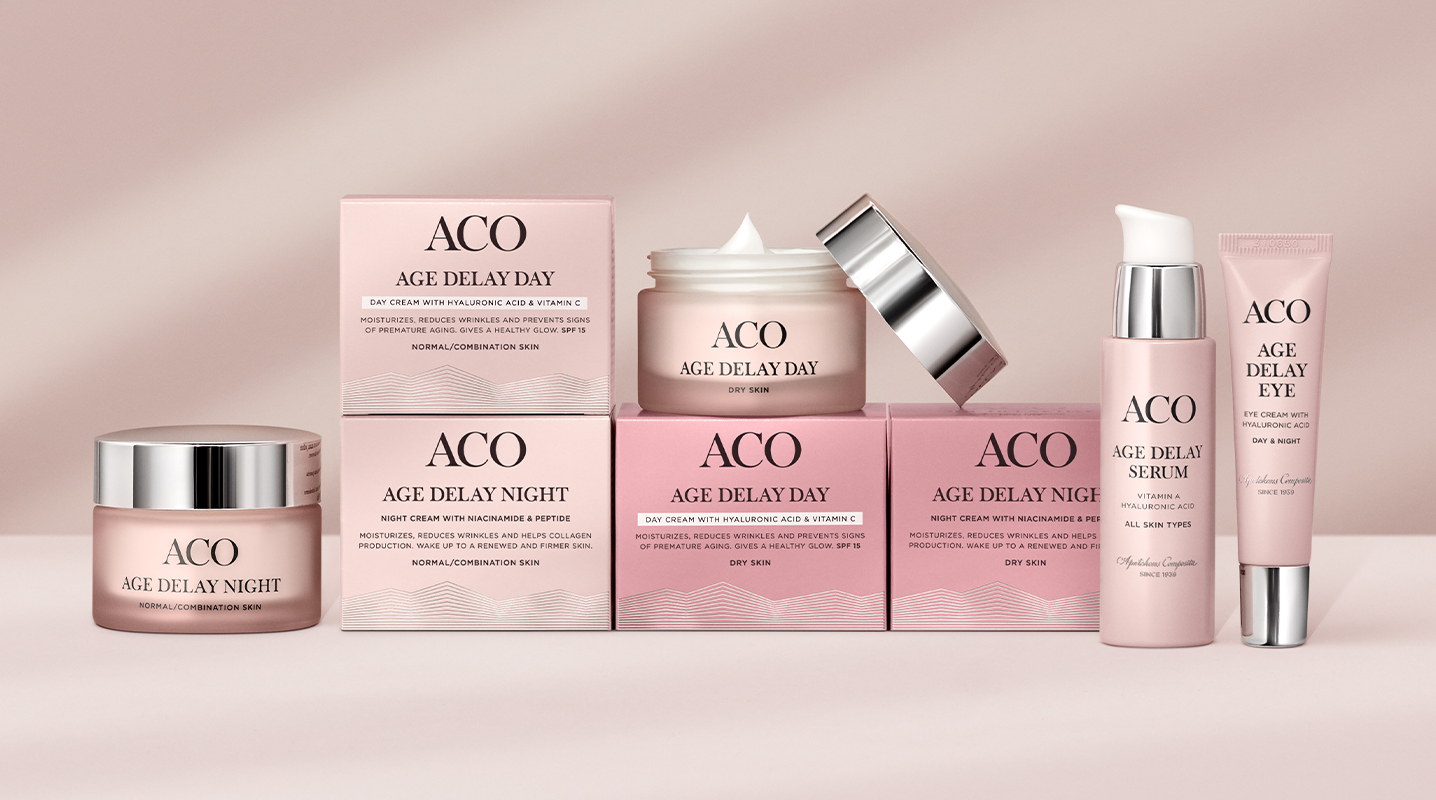
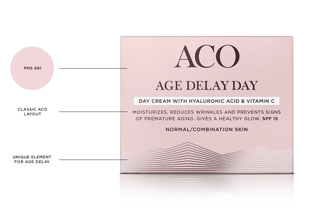
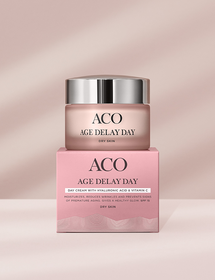
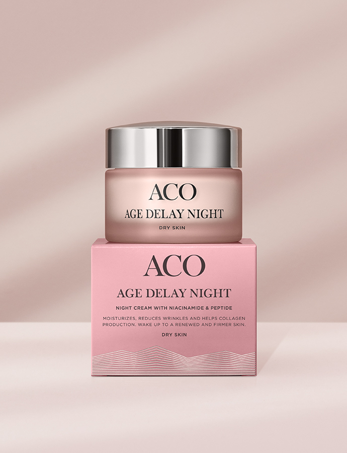
The base of our packaging design is a light dusty pink tone. This colour was chosen since it has a connection both to the old design and to ACO as a brand. Pink is also a common colour within classic anti age products. To make the design stronger and more distinct we also added a graphic element made up of silver lines. The idea of the lines is to show how the skin evens out when using Age Delay.
Our design made Age Delay stand out on shelf as well as being a natural part of the mother brand ACO – with the proud logotype, elegant typeface and layout.
NAMING
DESIGN ELEMENT
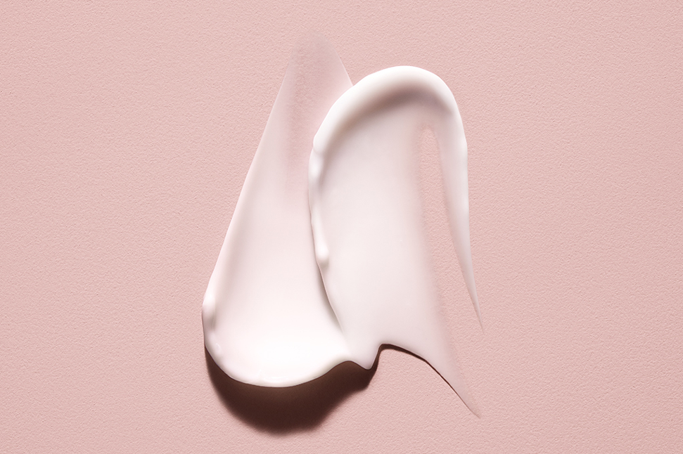
The lines on the packaging are a strong design element, and an idea we took further in motion and communication. The idea of visualising even skin took different moves and shapes. In social media as an animation, in film the lines appear as a pattern made of face cream that smears out, but also as a shadow play in the background. The lines have become a strong key element telling the story about Age Delay in all touchpoints.
COMMUNICATION CONCEPT & PRODUCT LAUNCH
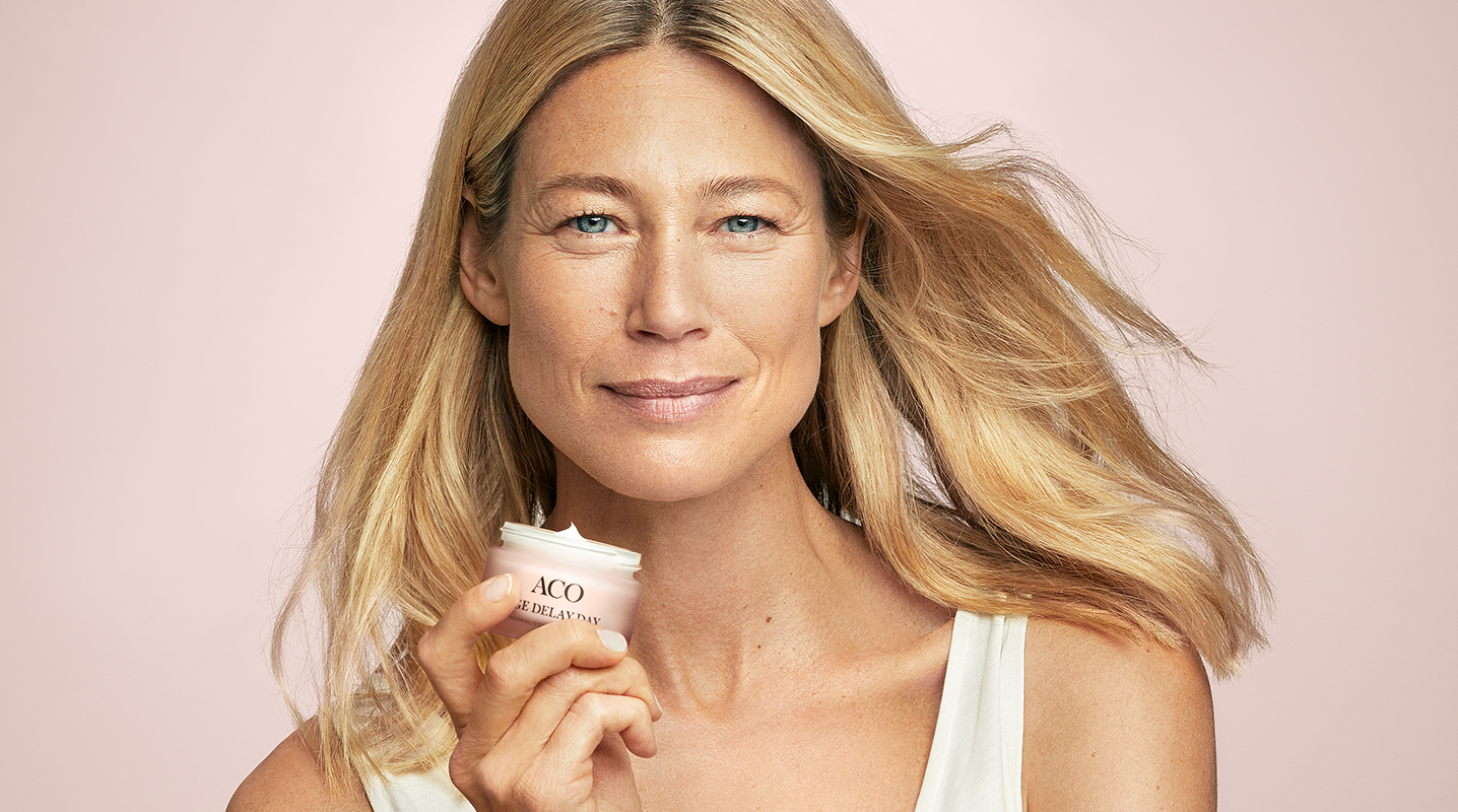
The overall communication concept for the launch was “Age Delay with ACO”. Informative how-to-films showing all the products, the powerful ingredients and the face routine in a simple and playful way.
But to give the consumer an opportunity to the achieve the absolutely best results the concept also included other ways to Age Delay. With the insights that stress and sleep are common causes to aging skin we created satisfying videos and breathe exercises to help people stress down and improve their sleep.
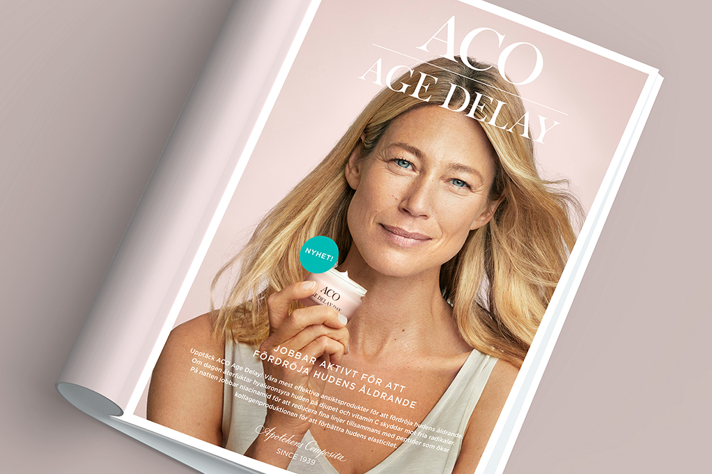
For complete Age Delay experience these films works parallel together. The outcome was both films for TV, digital out of home and social media, but also included printed material such as sales folder, print ads, and POS-material.
