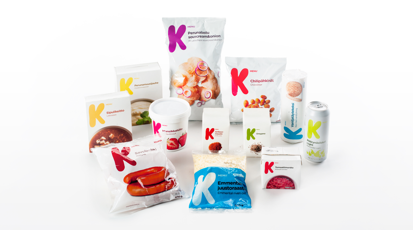
K-Menu
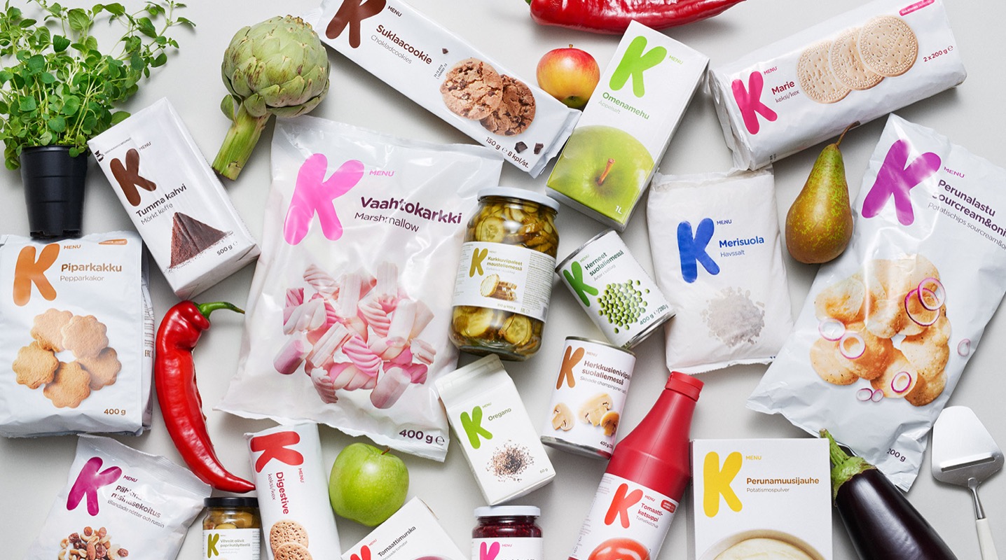
Private label
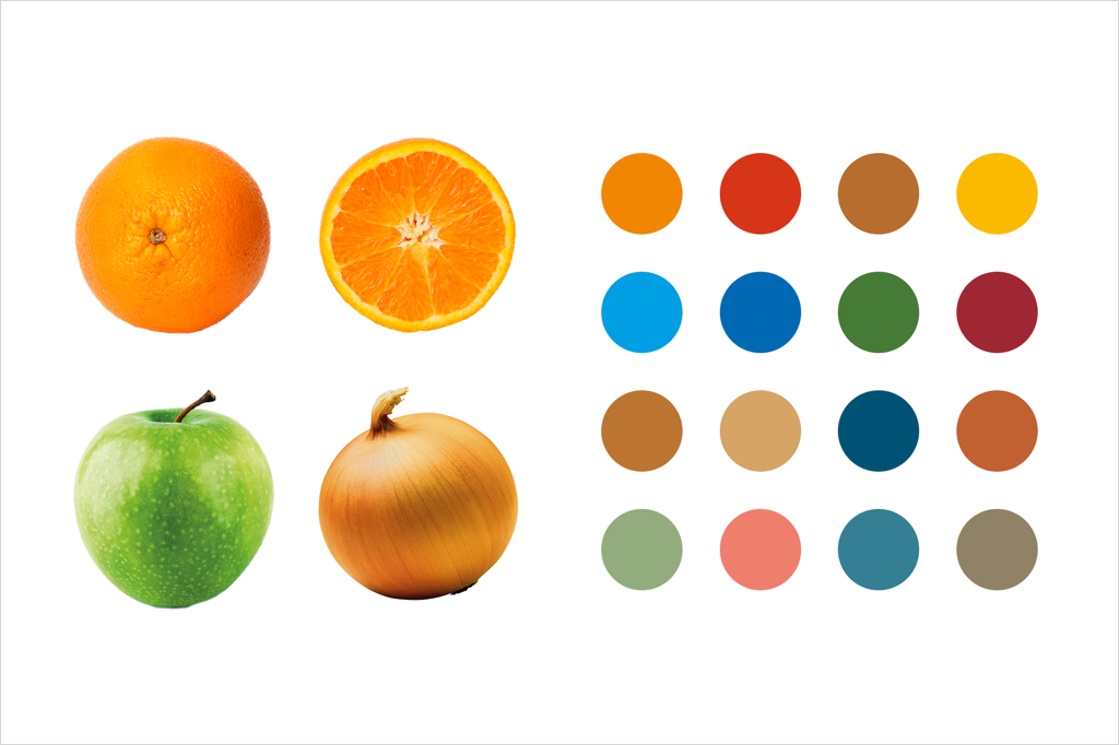
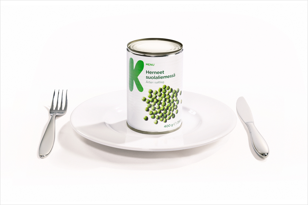
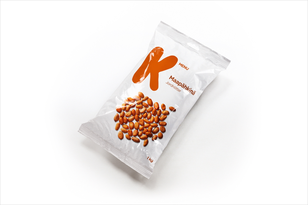
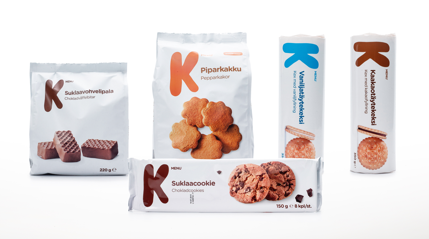
For Finnish Kesko we created the private label K-Menu - Visual identity and packaging design. To strongly connect to and strengthen the mother brand Kesko we let the K be the hero element. The strong visual expression creates a confident shelf impact, yet with a simple and humble look that signals value for money and every day use. The clear design system and photo manner allows effective implementation on a wide product range. The brand was launched in 2014 and has since then expanded to cover hundreds of products.
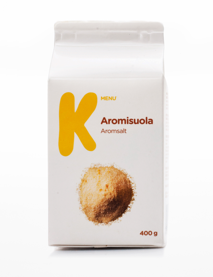
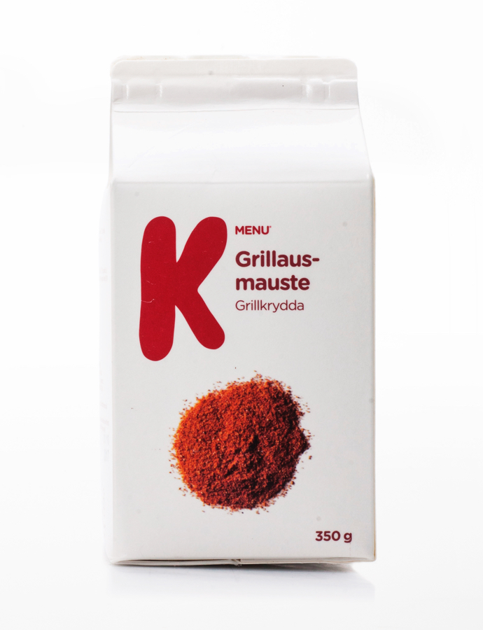
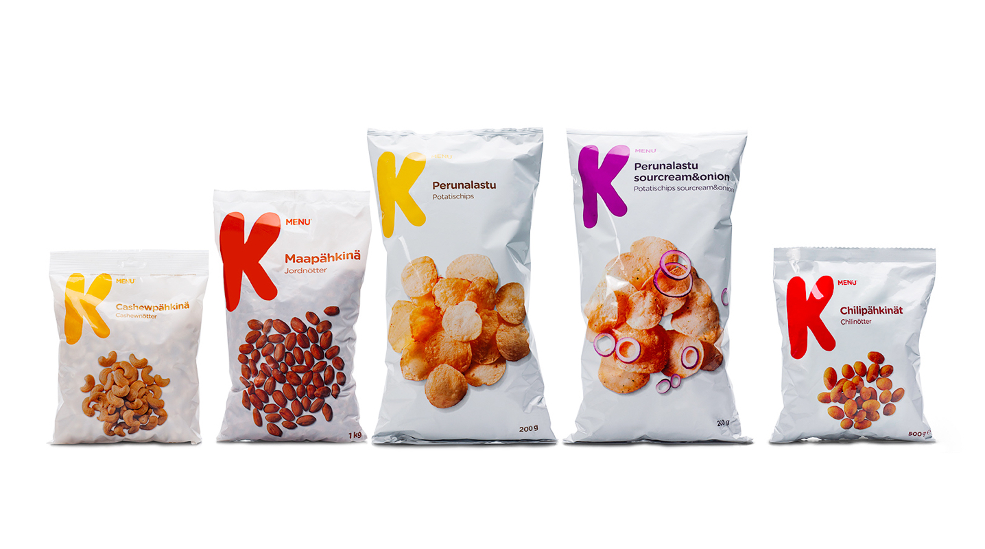
K menu is a private label in the value for money segment in Finland that was launched under the umberella brand Kesko in 2014. Our assignment included creation of brand name, visual identity, a new packaging concept and communication.
