Reviving an Icon
Läkerol
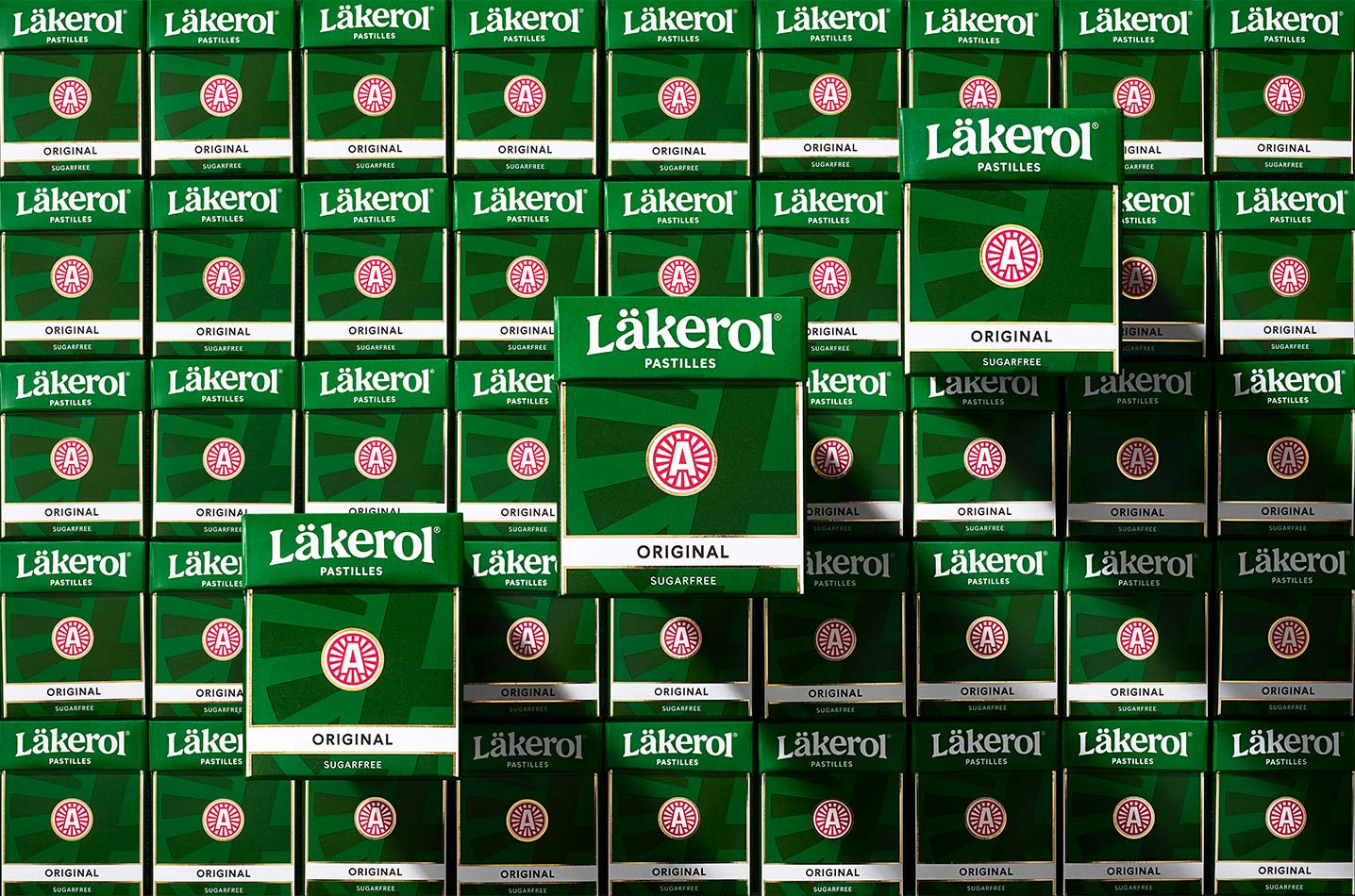
Since 1909, Läkerol has been a well known Swedish pastille brand with high recognition and strong emotional bands tied to its devoted followers. To preserve and revive Läkerol’s soul, we’ve focused on the rich heritage of the brand, without turning it into a retro design.
Logotype and A-symbol
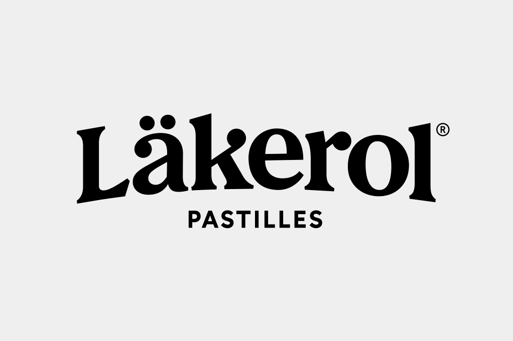
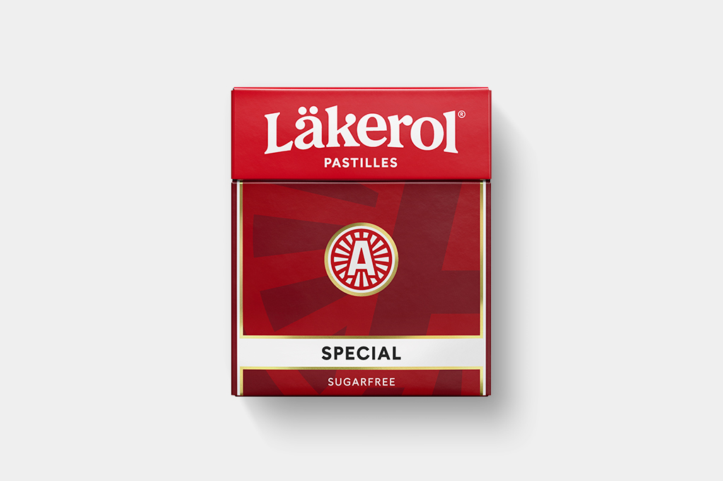
The logotype has been completely reworked, inspired by the rich history of wordmarks the brand have used since 1909. The characters, classic san-seriffs with modern angles together with the characteristic arc gives the logo a humble, yet distinguished look.
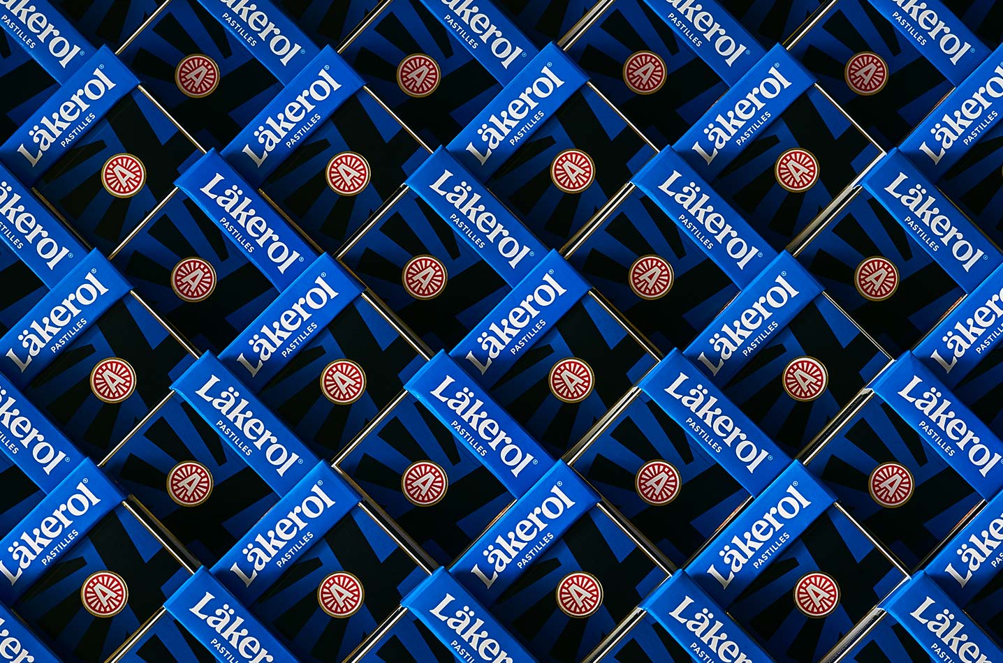
The A-symbol has been simplified and optimized for smaller areas. It’s placed in a classic Läkerol way – in the centre of the front and on top of the lid. A scaled up version of it is also used as a graphic background pattern.
Colors
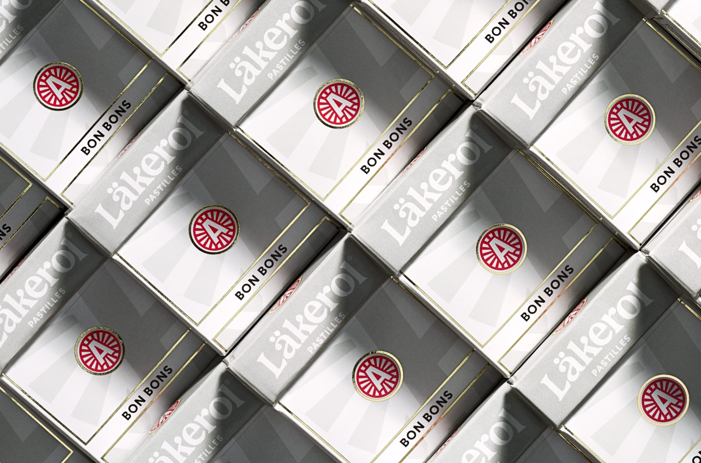
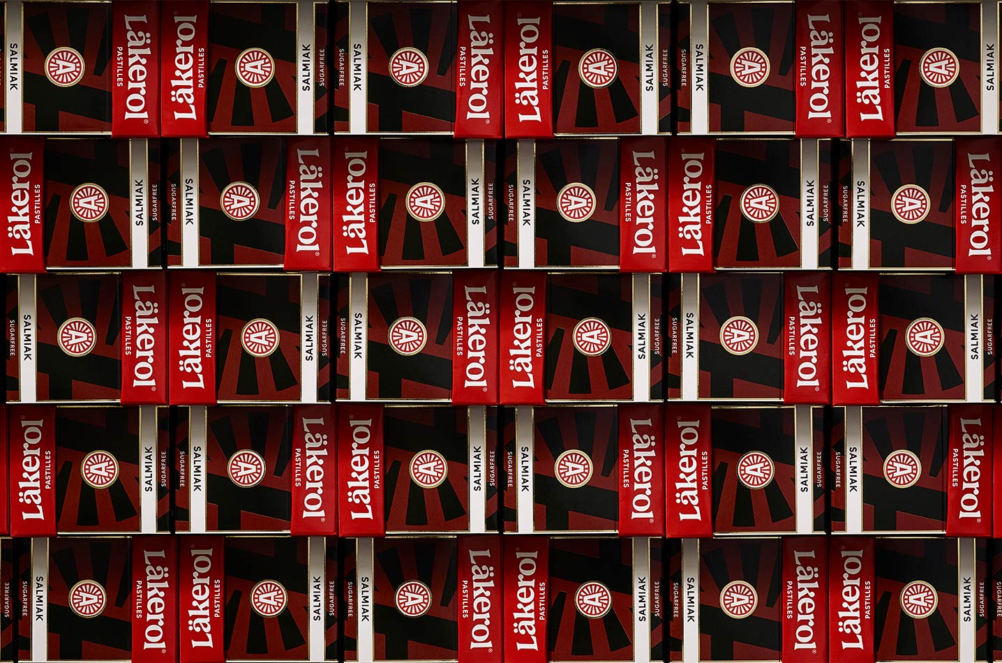
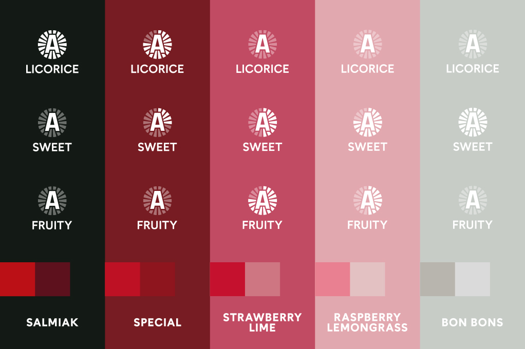
The front has been simplified by removing pastille images and flavor illustrations. Instead it’s through the three tone color scheme of each pack we communicate the full flavor. This clarification makes it easier for the consumer to find their favorite flavor in the shelf.
The darker color, the darker taste. Each flavor has been arranged according to a flavor system, where licorice based flavors owns the darker tones while the more fruity and sweet flavors owns the lighter color tones. This creates an intuitive way for the consumer to find their taste preferance.
Layout & Typography
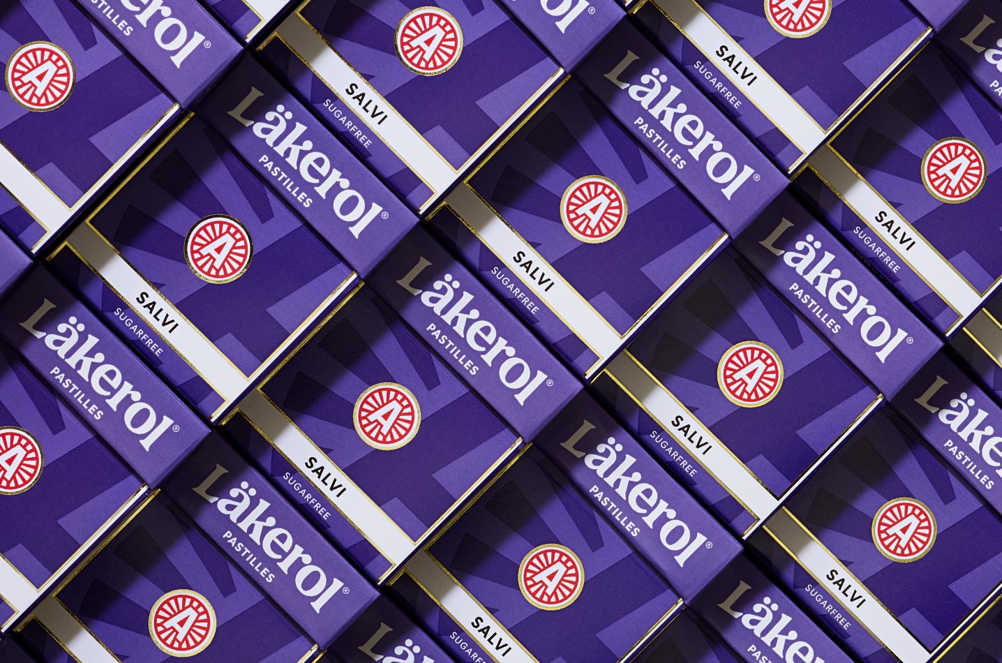
Every element on the pack has been refined and placed in a way that conveys quality. With a clear and unified expression we’ve created a bigger impact in shelf.
An infotainment area has been placed on the back of pack that curates and clarifies the different flavors.
