Sensitive Balance creative concept
ACO
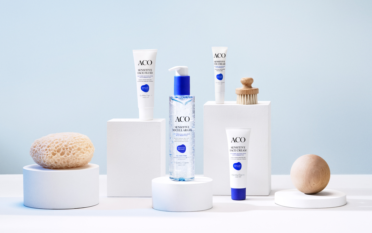
Packaging design
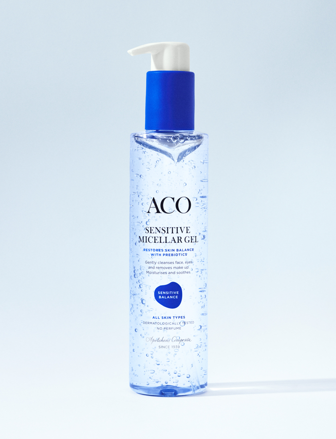
Naming
The ACO tonality is always honest and clear to make it easy to find, understand and differentiate the product series. The name Sensitive Balance is no exception, here the word Sensitive clearly speaks to the target group. And the word Balance comes from the benefits of prebiotics, which is the key ingredient in the series.


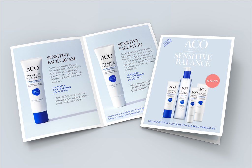
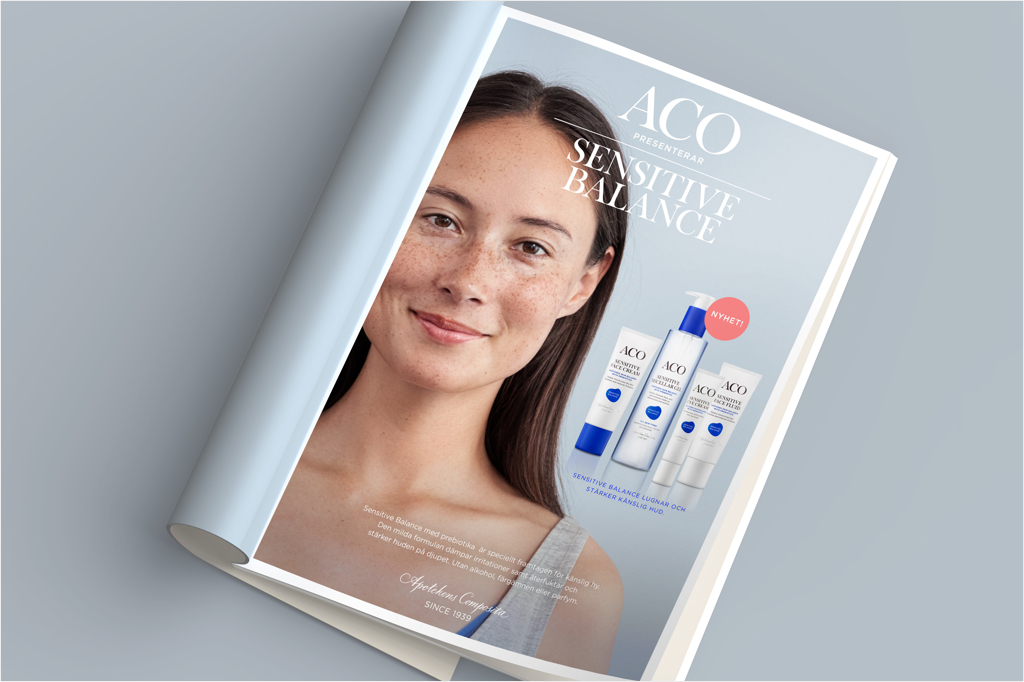
Launch campaign
For the launch we created a campaign to communicate the new range, highlight the products and its innovation. The visual expression in the campaign is connected to the packaging design with the blue graphic element, linking it strongly together in all touchpoints. The outcome was both films for youtube, digital out of home and short social media films categorized in to range, single product and in depth key ingredients. The campaign also included printed material such as sales folder and print ads.

Contact
Box 6016
102 31 Sweden