Instore Concept
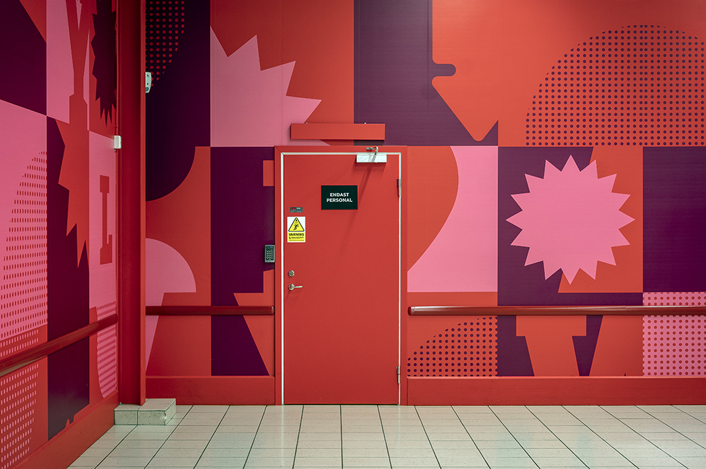
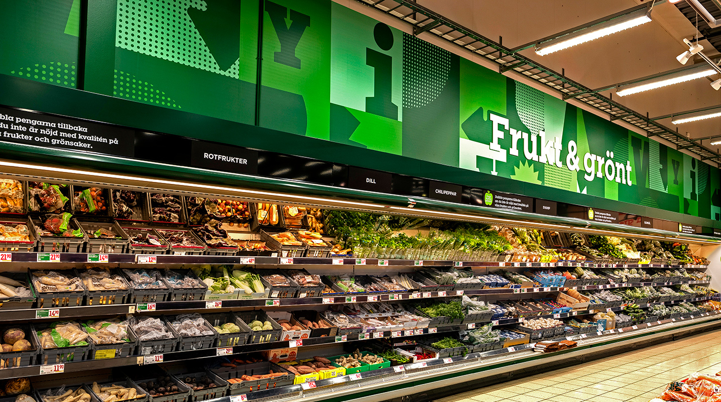
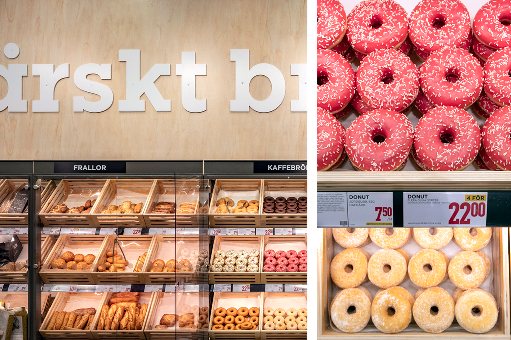
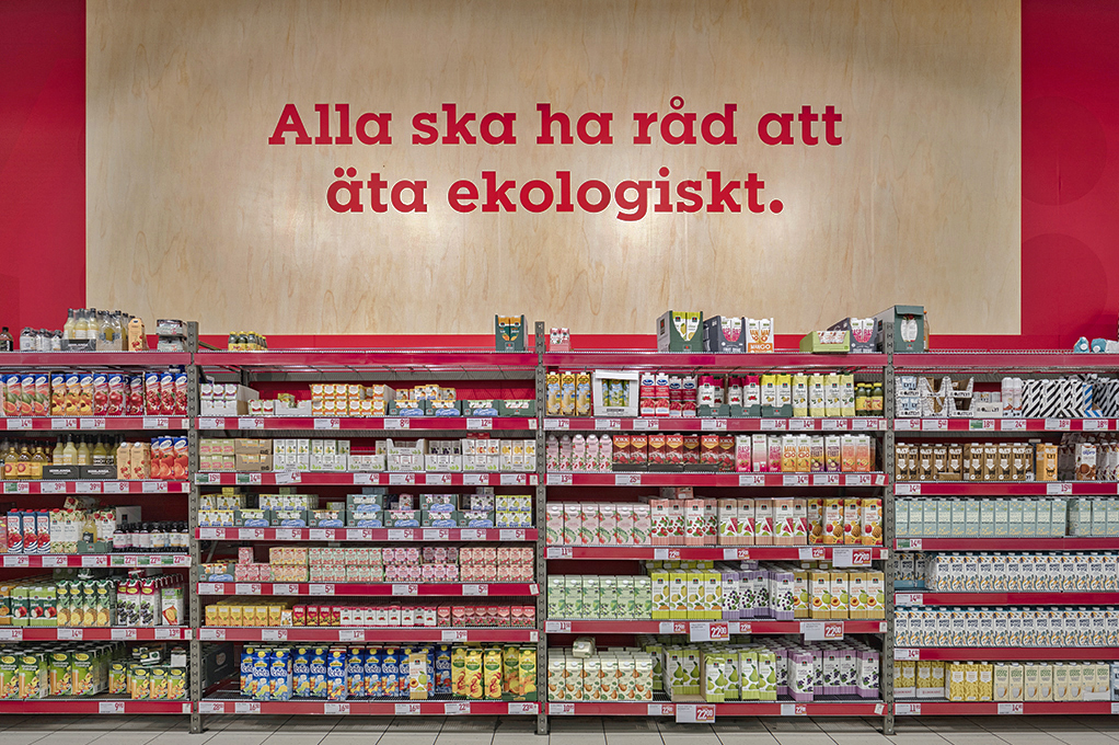
The updated look was created through a number of dierent elements. From the Willys pure red brand colour, a wider ”redish” colour scheme was added along with a light wood material. The walls has also been given some extra treat with a new dynamic pattern.
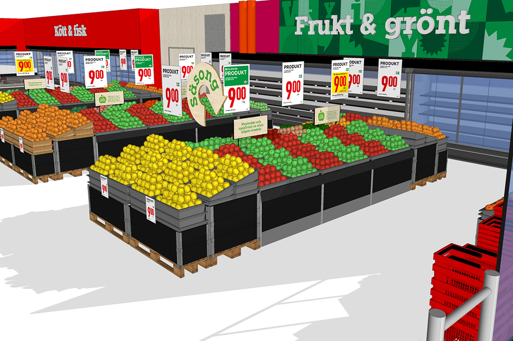
The new signage system for in-store oers comes in various forms. The idea of the forms is a irt from today’s and early stages of well kwown pricing signage. By marry two dierrent forms – one new form can take place.
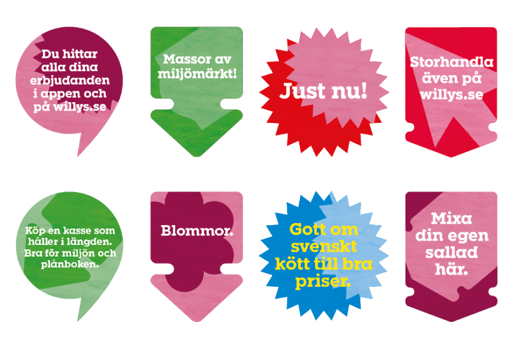


Nord ID looked over the tone of voice for all in-store communication and the result is more bold and clear.
Along with the new graphic elements, an update of xtures was taken place. For the metal tubes a dark grey colour was added and wooden elements became more common.
All together – the new Willys store concept expresses a more zestful, vivid and dondent feel that works well with the Willys brand.
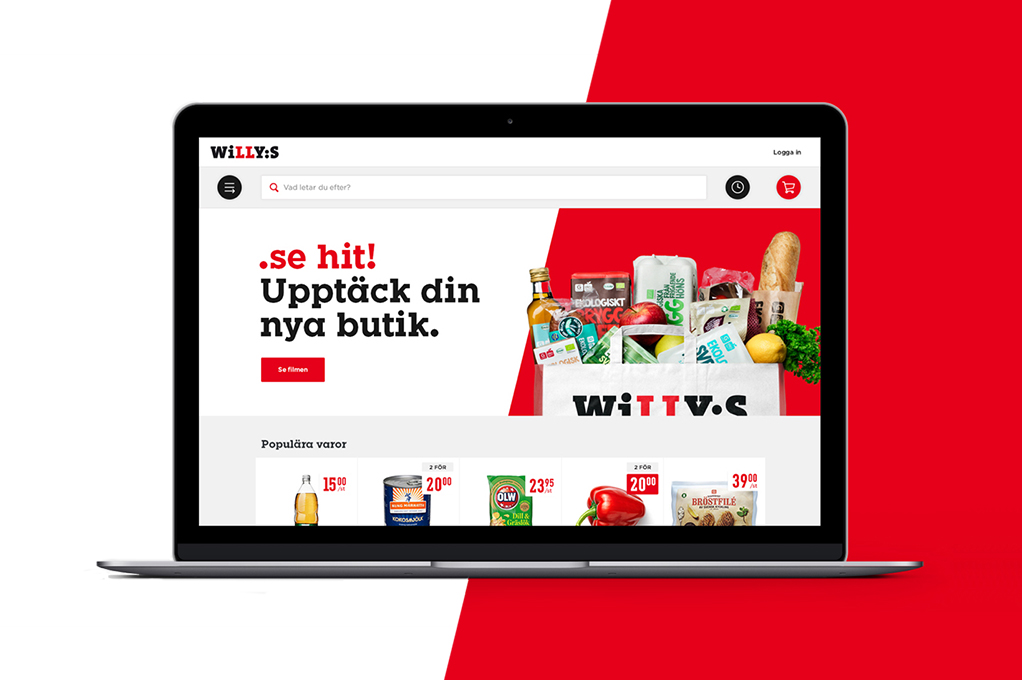
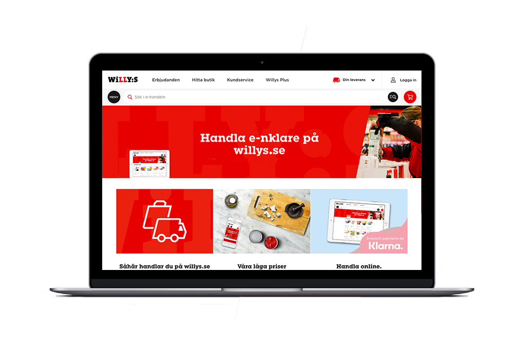
With over 100.000 groceries, our challenge was to create a steady and an intuitive foundation, making it possible for costumers to quickly nd what they are looking for. Our main goal was to make an easy, clean and predictive e-commerce, taking away all the things you don’t need to complete a purchase. To make this possible we created three key components; easy access search, category navigation and a responsive grid putting focus on the products. The result is a minimalistic, straight forward and uncluttered design focusing on fewer components with greater impact.
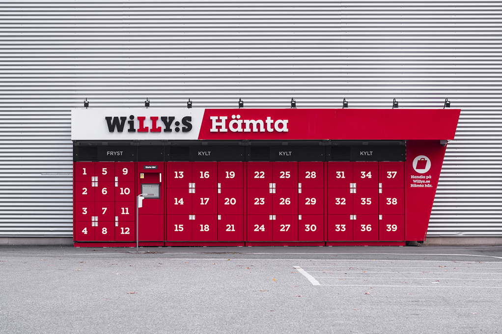
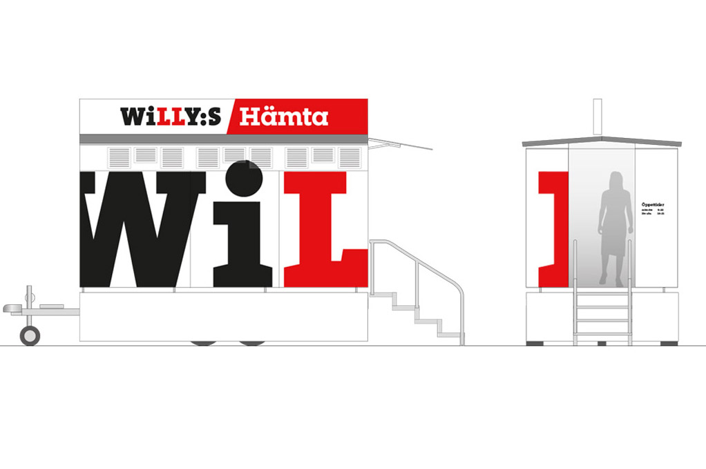
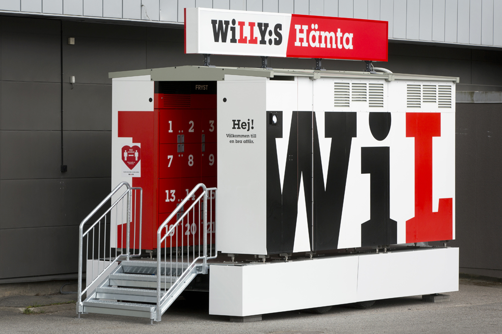
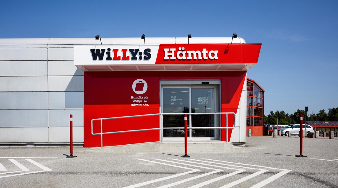
A streamlined experience To create a better and more streamlined shopping experience for Willys, the online store is complemented with a pick up point at the physical store. The design and functionality of both the digital and physical presence are developed simultaneously to ensure a synergetic visual appearance and experience.
